MOBILE UI UX – Everything you need to know about it

Design in hands with technology together has created a world of interface designs like never before. Mobile UI UX has become a popular trend of 2019. However, every trend goes through a set of stages. The first one is uncertainty, then captivation, and finally, bored & frustrated about it.
The mobile UI UX Design aims to provide Customer Satisfaction through Interactive & Improved Design.
Catchy Names
- Temple Run
- Mine Craft
- Candy Crush.
Consistent Templates
Once you have set up the name, you have to plan the templates. The templates should be consistent across all devices. For example, if your application with mobile UI UX is targeted to the iOS devices, it should fit various proportion screens. Those with less bezels & the predecessor model.
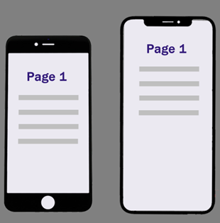
Always a Prioritized Framework
Most applications employ these strategies the top section or in other words the section where the user lays his eyes, is where the high prioritised elements are place say the User’s Account setting on the top corners or the Cart option in eCommerce sites.
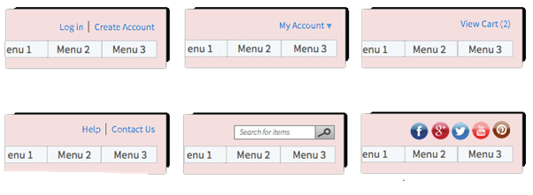
Avoid Dead Dead End Pages in mobile UI UX
The element is self-explanatory. Don’t lead your users to pages that no longer hold the content.

User First
Make sure the Users can complete the stuff they came for first before you promote your products & page through pop ups or redirections.

Function Over Fashion
The fonts, icons should be well spaced & placed in a manner that efficiently makes use of the spatial option provided. Icons should be of tap size & optimal space. Don’t use double taps on mobile.
Pick a Colour
When picking a colour, choose contrasting colours for the fonts in comparison to the background.

Abuse of Creativity
Don’t make users learn something new significantly to just use your application.
Animations&Graphics Should Lay a Strain
Don’t use heavy animation & graphics that takes out on the loading process. If the site or app contains animation and graphics they should load first. Loading time should be less than 17 secs. With everything expanding browser capabilities opened the door for animation. Not just as the motion of elements, but a legit design opportunity.
Let Your User Know That Something is Happening
Use progressive tool like a spinner or a bar with the the job it has completed. [ Could you be any more vague about it? (in Bing’s voice)]

Scroll Do’s & Don’ts
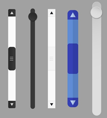
No long scroll or vertical scrolls pages. Be definitive using hyperlinks. Proper scroll information to indicate if there is more content or not. Everybody quits pages that are too long. Definitive Navigation Bar that doesn’t change from page to page.
Punctuations & Separators Make All the Difference
Use separators to make the application more user friendly & where necessary.

Distinguish Contents.
Links on websites must stand out — use blue text and/or underlining to indicate hyper links else if you are referring to another site or book, you can redirect your users.

Never — Ending Clicks
Don’t make the user click too many times.

The Necessity To Keep Up With Trends Is An Absolute Neccessity.
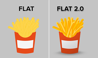
Flat Designs are becoming popular.
Do Not Overload
Don’t fill up the pages with just contents. Breaks are absolute necessary.

Equity across Devices
As much as uniformity across the platform & models, its essential to balance the equity across devices as well.

Familiarity Is Your Friend
Use appropriate icons wherever necessary, but again don’t over dose on the icons. On the other hand, don’t use a popular icon for a various element.

Don’t Deal Numbers To Your User
When representing quantity be clear about it, don’t make your user do the math.

Group Similar Elements
When providing options or menus group likely elements together.
Flexibility
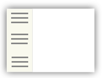
Forms are expected to be simple & flexible. Remember that certain forms not just long & tiring but also won’t just accept a particular detail and will pop up an error. [ Don’t be that guy.] Forms should be flexible.
Simple & Straightforward
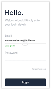
Don’t pry on your user or exploit the opportunity & extract information from them. Tread lightly.
Synced Usability
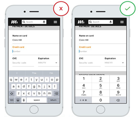
Once a user is provided with the form, it is essential to provide with the proper Input as well. If you are requesting for a PIN, Credit Card Number, etc., provide with a numeric keyboard.
Zig Zag Pattern
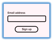
Stick to a single-column layout. Single-column layouts are easier to follow, understand, complete, and submit for your visitors. A study shows that a user who is made to sit on a form for more than 15 seconds finds it annoying.
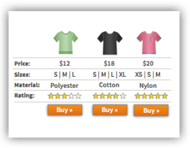
Multiple Forms — Skip Fields
When employing multiple forms don’t make the user re-enter previously entered details. Fill it for them. This consumes comparatively less time & makes it user friendly.
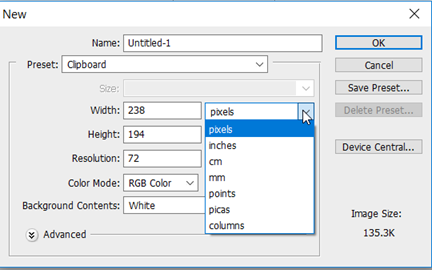
Sampled Data
Users will misinterpret the same information in different ways. Provide sample data. (A numeric measurement, say a canvas in CMS, could be calculated in INCHES or FOOT.)
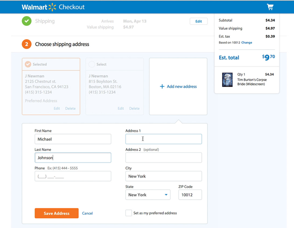
Tread From Light to Hard
When designing a form, place the easier elements say a person’s name on top or an email address. If you are an e-Commerce store and have to add payment use pre-defined forms with user’s address and other collected details. Add Credit/Debit Card details later.
Blunt Error Messages
It’s easy to say that something is wrong but be specific about it. Don’t speak computer. Use the language most users are familiar with.

Validate Engagements
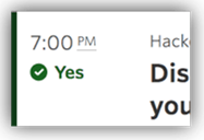
Use coloured sentences to employ the rights & wrongs of the form. When a user enters the correct information validate with a green tick mark.
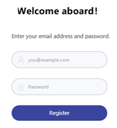
Helper Text (Box)
When including Text boxes label them separately, only try pairing them with helper texts a.k.a placeholder texts to provide a level of ease to your user, include names under all situations.
Necessity & Optional
Distinguish between the fields the user has to fill in & indicate those with an asterisk.
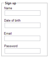
Equally Spaced & Equally Placed
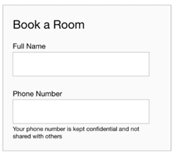
When placing labels don’t leave a white space between the label name & the text box. The spacing between the label and its corresponding field makes it difficult to determine what to enter where. When the field labels are close to its corresponding fields, it eliminates confusion about what to enter & where.
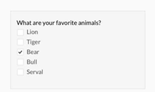
Radio Buttons & Check Boxes.
When employing radio buttons or check boxes stack them up vertically.
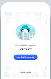
Alternating Location Switch
Truth is we all travel once in a while, and the one thing we carry on everywhere is our phones so when I land in London, I am not going to be conscious about changing the location, I would like my application to do that automatedly & be notified about it.
Old School Meet New School
In almost every form from the early 2000’s there is an option in forms Clear or Reset. WHY? Just why would I want to clear an entire form I just took my time to fill in. I have a Delete Key and a Backspace Key purely for correcting purpose. Please don’t make it an option now.
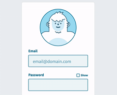
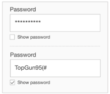
Password
Password fields should contain an option to view what the user has entered.
Do Not Hide The Sign In Option.
Some applications hide the sign in or log out options under a drag menu. This highly not recommended. Users when logging in or out are always in a hurry, hence it is recommended to treat these as highly prioritized functions.

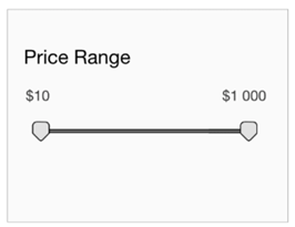
Slider For Ranges
When providing ranges for certain elements say price or age provide sliders, it is fun & consumes less time.
Automate Actions
Engage through Auto complete, Auto capitalize, Auto correct, Auto-fill. Although you cannot fill in every detail for the User, it is crucial to explain the WHY’s & YOUR POLICIES in a user understandable term for sensitive details.
TABS
If you need an excellently organized format you should exploit TABS. Tabs divide content into meaningful sections which occupies less screen space. Even though you have tabs don’t overdose on them.

More Than a Single Onboard
Most applications and sites nowadays are pairing up with tech celebs such as Google or Facebook to sign up, in addition to the email facility.
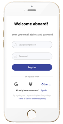
Designing a Call to Action Button
What is a Call to Action?
In marketing, a call to action (CTA) is any message designed to prompt an immediate response or encourage an immediate sale. It’s as simple as it sounds: a call for someone to take action. A call to action is a word, phrase, or sentence that tells your readers exactly what you want them to do next.

Colour and shape
Psychology science has specific branches devoted the influence of different colours and shapes on our consciousness. Vibrant colours are great for creating contrast and drawing attention. Colours when coupled with catchy CTA’s is the best deal.
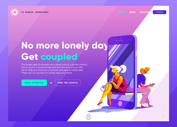
Don’t Be Extravaganza with Contents
Be brief about your contents.

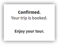
Provide Confirmation
It is crucial to acknowledge when a user goes through the elements, and finally performs the primary intended action. Provide him through more than a single means of confirmation.
Personalised Experience
When designing a product or service make sure that your product can handle both its targeted & mass users. Providing users with targeted & most delighted experience.

Conclusion
With the ever-growing techs & tools to make our products better by day, mobile UI UX design has been allocated a front-row seat & it is time that we catch up with that.
Simple and effective design makes the user feel like they don’t have to tread a heavy process app making them a success.
Centizen
A Leading IT Staffing, Custom Software and SaaS Product Development company founded in 2003. We offer a wide range of scalable, innovative IT Staffing and Software Development Solutions.
Contact Us
USA: +1 (971) 420-1700
Canada: +1 (971) 420-1700
India: +91 63807-80156
Email: contact@centizen.com
Our Services
Software Development
IT Staffing
General Staffing
Remote Hiring
Products
Software Development
UI/UX Design
Product Development
Devops Services
Managed Cloud Services
Tech Stack
Contact Us
USA: +1 (971) 420-1700
Canada: +1 (971) 420-1700
India: +91 63807-80156
Email: contact@centizen.com


