UI/UX in Mobile App Development
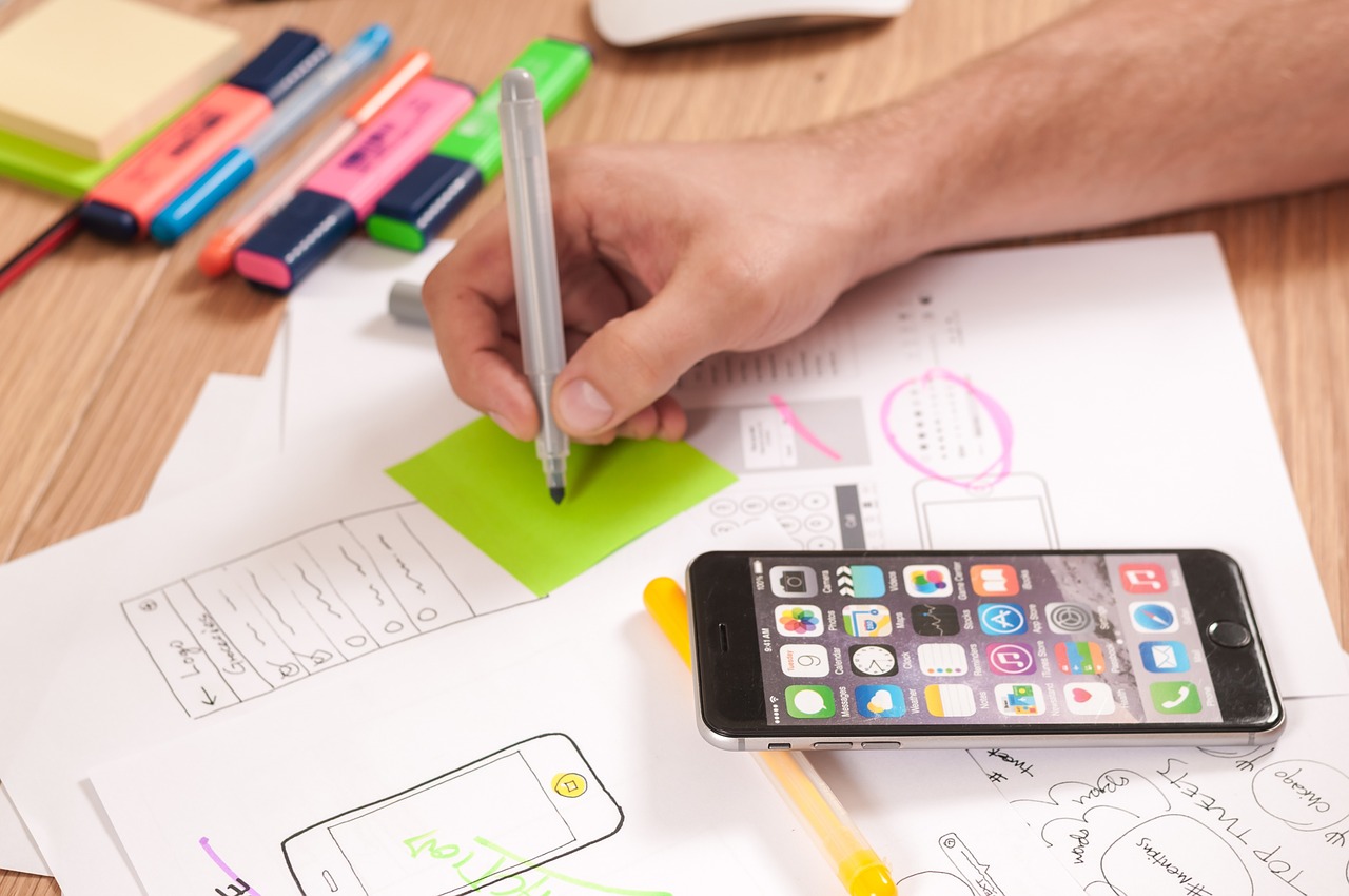
We have come a far way from electric bulbs to smartphones and holographs. Digital users are increasing in folds and moreover people have become dependent on the devices. The reason for this acceptance among its masses would be designing and ease of access. Brands are focusing on designs, colour, feel and appearance of their products. Another popularity factor is to access everything from anywhere. A recent study shows that roughly 197 billion data was downloaded from mobile apps in the year 2017 alone and can go up to 353 billion in the year 2021. Based on these facts every brand aims to create an interactive UI/UX in mobile app development that aims to increase overall user experience. Design is not an easily overlooked concept these days.
Design is an intuition based on Arts & Science. To help you understand better about designs you must know your customer how they interact with the system. Are they able to follow up the sequence? This is known as the User Interface (UI) and User Experience (UX).
User Interface (UI)
User Interface design deals with the interaction and behavioral response of users with the mobile application. A Designer’s goal is to create designs that a user finds easy, attractive, efficient and pleasurable without compromising the functionality. Typically, an UI design refers to the Graphical User Interfaces (GUI).
User Experience (UX)
User Experience focuses on the user interface elements and aims to provide customer satisfaction by improving the application’s usability, accessibility, and interactivity provided.
How UI/UX yields better Mobile Application Development?
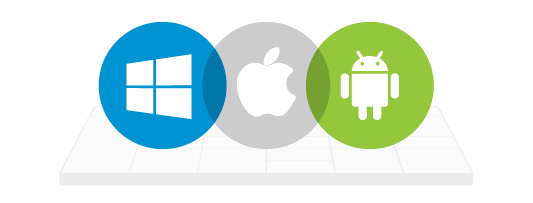
While designing the UI/UX in mobile app development ensure that the layout maintains uniformity across all platforms.
Equity across platforms
When designing for native platforms, the application design shouldn’t be exclusive to iOS or Android. It is vital to cover all bases whilst simultaneously admissible of their own rules/guidelines to maintain integrity.
Keeping up with Consistent Templates
Designs should be in a way that aims to grab attention and if possible, turn them to potential customers. To do this you have to be familiar with colour & consumer psychology. (Read here about that.) Use standard options from colours to icons.
Clarity
Designs should be in a way that resonates a single concept and must not be in a way to create confusion or start the wrong impressions for its customers. Once a brand launches its applications people are going to get some time to familiarize themselves with the application. Think of it as this way, when a new game comes out initially you are going to lose a few until you learn the moves & how it works (Or build a palace — Mine craft) .
To familiarize themselves people are going to read the instructions, go through the notes and settings where the information should be typed in the right way and stylized fonts should spell things clearly and be readable. Another thing about fonts and icons is the size or pixels or points. Don’t place them too close and not too small.

Uniformity
As much as we focus on the design, another thing to keep up while designing is Uniformity. Uniformity lets user navigate without any hindrance facilitating smoother flow across the elements. The Development team should predict how a user might tread and should place elements in a way the user can grab & go.
Bugs & Errors
Users must be notified when something goes wrong. When displaying errors don’t be deadpan about it. Provide status messages or walk them through the solution for the issue.
The no message or plain old error message state is called as dead end or zero state message.
Efficiency of Skeleton Screen into Design
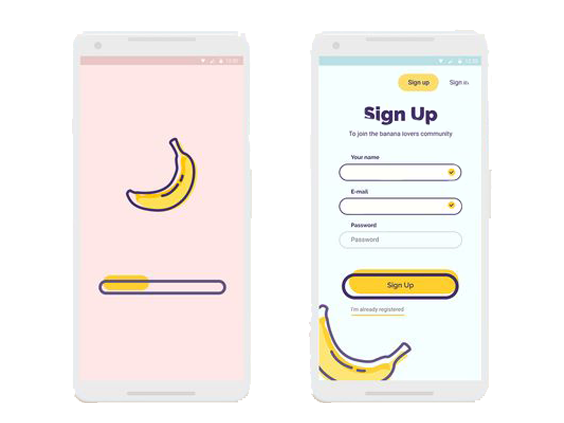
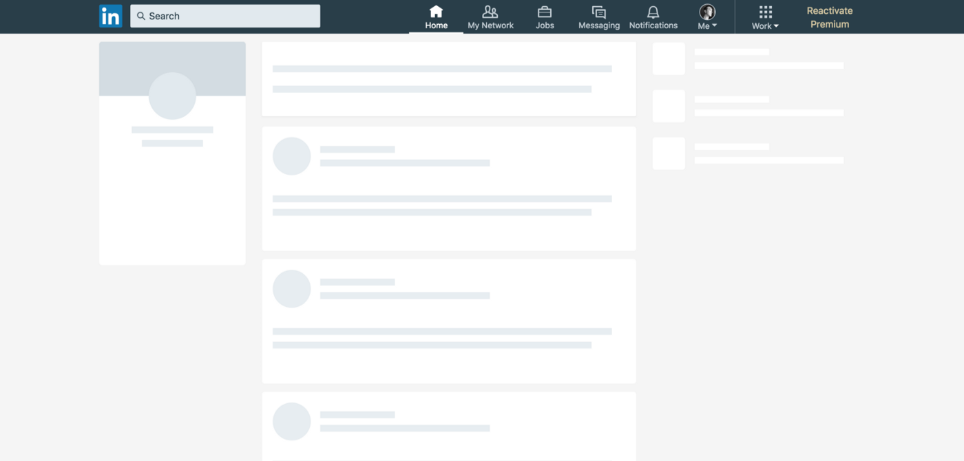
Your user’s time is precious hence loading a page shouldn’t take anything more than a fraction of minute. Keep in mind that the quality of the network plays a role too. When a page is loading you have to show your users that something is happening try progressive bars & spinners.
Skeleton screen aka splash screen is a blank template into which information is gradually loaded. The best example of this is in the iOS Human Interface Guidelines. Apple’s guidelines showcase an outline excluding text and other elements that may change. Initially, it fills the header & the footer after which the contents/middle part known as the placeholder creates the illusion as if the content is being loaded into it.
Targeted Touches
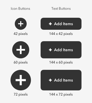
While designing your app’s interface, make them into appropriate sizes so the users can access them without the caution spirit of tapping the neighbouring elements accidentally. Elements & Icons that facilitates drag & drop functions or tap should have the necessary spatial room else can be left with a frustrated user.
Controls should be sized at 7–10 mm so they can handle finger taps. The edges should be made visible. This provides actually hitting the target.
Optimized User Flow
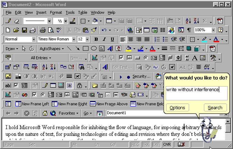
We have talked about user flow at the beginning of the chapter. Optimizing this is part of the process. To make it more appealing to the user split and start with small tasks, automate all possible data like addresses or names as such. Use standard forms to get the user details. Limit to one action per page-screen. Don’t clutter elements.
Stairs to the big picture.
Instead of heaping out the tasks start small. Split the tasks yet stay focused on the bigger picture. Best example is the check out page in an e-commerce app that shows you what you have done so far before an order is placed.
Automated fill
Use pre-filled forms with the data you have collected from your users. It could be simple as detecting location or filling user’s details such as name or mail address. A best example is food delivery apps do not ask users to enter their address manually.
Standardized Forms
Allows user to easily identify or predict where certain elements maybe present. For example when signed into a new app, the user account details are more commonly placed on the top corners of the page with the user’s name/id. If the user finds elements easily then there is no troubled flow in the process.
One can be a lucky charm
To make the app session more lively & interactive, limit the action to one per page. In other words, don’t design a page that does every single task it is supposed to.
Clutter is never pleasing
Never try & fit every sing element to a single page. When working on an application no matter its seriousness, ease should not be compromised to provide other factors. As much as you make sure there is optimal space between icons/buttons it is essential not to dump icons to a single tier.
Conclusion
Every brand thrives or survives purely on its customers decision. Hence brands focus on pleasing them and appealing to their interests and even in some cases embellishes the products & services which makes them stand out. UI/UX has incorporated a decisive role in this process. Simple and effective design makes the user feel like they don’t have to tread a heavy process app making them a success.
Centizen
A Leading IT Staffing, Custom Software and SaaS Product Development company founded in 2003. We offer a wide range of scalable, innovative IT Staffing and Software Development Solutions.
Contact Us
USA: +1 (971) 420-1700
Canada: +1 (971) 420-1700
India: +91 63807-80156
Email: contact@centizen.com
Our Services
Software Development
IT Staffing
General Staffing
Remote Hiring
Products
Software Development
UI/UX Design
Product Development
Devops Services
Managed Cloud Services
Tech Stack
Contact Us
USA: +1 (971) 420-1700
Canada: +1 (971) 420-1700
India: +91 63807-80156
Email: contact@centizen.com


